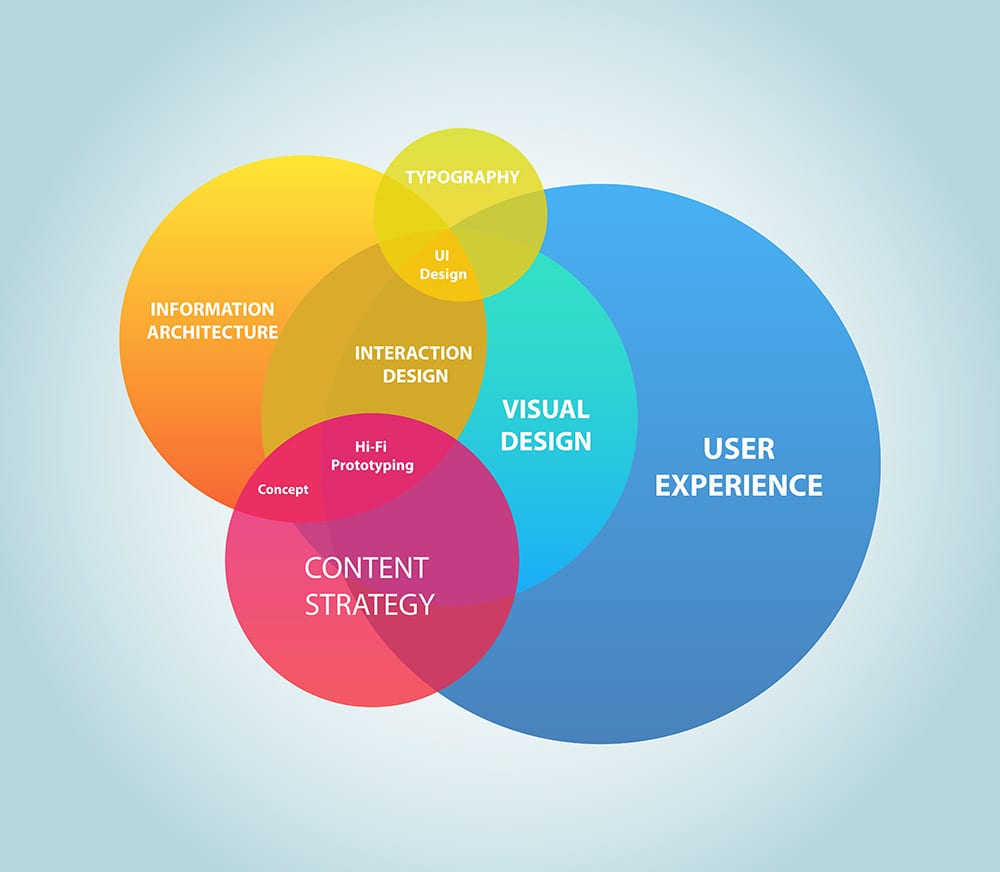
To be successful in today’s omnichannel world, UXD beyond visual design for enterprises is a critical success factor. Throughout the 1990’s and into the early part of the 21st century, visual design became one of the driving design decisions when it came to the user experience. UI was unintuitive, flashy interfaces were the preference over practical ones, and it almost felt as if the entire body of design professionals were obsessed with pushing the limits of the hardware in an attempt to “future proof” their designs without any consideration of speed. Thankfully, the wild west days are over, as design theory became more solidified. UXD beyond visual design is not a choice, but a strategic imperative.
The broadening of UXD has created a much sharper vision of what goes into designing systems beyond simple visual design decisions.
The expansion of UXD has created a much more intelligent view of what goes into designing systems beyond simple visual design decisions. We all know white space and font choices are important. We are aware that visually simple designs that draw the users attention to content are more important than flashiness. However, beyond that, what are some of the other elements of UXD that go beyond visual design in an enterprise setting?
Interactivity Time Frames
Users interface with a given system does not begin and end with just usage. There are four phases of user experience that all designers should take into consideration, especially when designing for uniformity at an enterprise level.
- Anticipated UX: This is before the user ever sits down at the system. They have been a part of your company ecosystem using other systems within your business, so they have already forming expectations before they even interact with it.
- Momentary UX: This is where the bulk of focus is for a lot of designers. The user is actively using the system and is having a direct experience. However, it is important to know that “experiencing” a system is only part of the whole user experience.
- Episodic UX: This is after a user has used a system and began to reflect on their experience. This is usually a time where the user with make their initial appraisal of your system design and will directly affect the anticipated UX for the next time.
- Cumulative UX: This is after a user has been using your system for a period. They are no longer thinking of individual uses of the system, but are reflective of the entire process.
Where Should You Focus your efforts on UXD beyond visual design?
A well-designed system is flexible and can have its interface altered without affecting its functionality. So decision making then comes down to the UXD. All four of these phases of interaction is important, but each one has a different weight depending on who the system is targeting.
For example, anticipated UX is important for client or customer facing systems.
A good example of this is an ATM. The customer has a preconceived notion of how an ATM functions and expects that most banks offer the same level of experience. Another example is a website. Users expect links to have an underline in the body of texts, navigation bars to be somewhere near the top of the page and fonts to be legible.
Design can be a substantial asset for employee-facing systems, as well. People who are joining your ecosystem have formed expectations on how individual systems work, from either school or previous work experience.
Sound anticipated UX is a result of having an understanding of the fundamentals of design, the study of competitors systems and the accumulation of data. When launching a new application, this is where the majority of resources focus their energy.
As your UX matures and you begin to receive feedback, the resource allocation moves into the momentary and episodic UX. This is where it is crucial that you design a data collection system that is sound in its procedures and technique to get the most accurate information possible from your users.
Finally, focusing resources on cumulative UX is important when you are beginning to make an overhaul of your system and are moving into the next phase. For example, the jump from 1.0 to 2.0. Once again, the focus on this should be data collection and on creating a strong post-mortem so that you know what went right and what went wrong.
Data Collection and User Feedback
There are multiple levels of information that can be collected and analyzed to improve UXD on all four levels of interactivity. This can include hedonic quality, engagement, motivation, enjoyment, aesthetics, and others.
To collect this data, you can use surveys, interviews, observation or pure statistical analysis. It is up to you to determine what type of information will be useful for your next iterations of your UX and system design.
HCI and Continued Research
The worlds of UXD and Human-computer interaction (HCI) continues to weave into each other at a fast pace. Both fields are still actively growing as more information about the human brain becomes available. HCI is so broad, encompassing dozens of areas of study, which what we think of as sound UXD today might not hold up even five years from now.
This is why it is vital to keep up with advances in both fields. As we continue to learn more and more, the landscape of design morphs and evolves. Again, just looking at what was acceptable 20 years ago to now is proof of this continued shift.
Have you moved on to using UXD beyond visual design?
Other articles that may interest you:
